Debugging for accessibility
An "obviously not complete" guide to accessibility for developers. At least you'll see that debugging for accessibility it's complex but not scary.

Front end developer, Accessibility advocate, Avid learner... I'm really just Another Coding Guy.
Does this even make sense? Accessibility is not a single step in the production pipeline, but a guideline that has to be kept in consideration at EVERY step, from the first approach with the client to the maintenance phase. So asking a developer to debug for accessibility simply means that a specialized actor of the production chain should handle by ownself alone all accessibility issues.
Since we're talking about debugging, here, we'll focus on the production phase, mainly on the front-end side. For this, I'll not talk specifically about colors combinations, typography and other aspects that are mainly responsibility of a UI designer. Luckily we can leverage the help of some specific tools, but keep in mind that they're just tools, and cannot be considered the “last word” on accessibility evaluation.
It'll be quite a long article: I'll not go too deep into details, but I'll try my best to give you all the tools and the advice needed to tackle without too much hassle the accessibility side of your project. But let's proceed with order...
Before we start: understand the requirements
I'll not talk about WCAG guidelines here, but we need to address them since they're what we will have to tend towards when debugging.
Make sure to understand them, not only to know them. There is a huge amount of them, but you can simply begin with the elements you need for your project. We'll handle this topic extensively in other articles, but I needed to address this point because if you understand the “why” it will be easier to define the “how”.
I suggest you also take a look at WebAIM Screen Reader User Surveys (you can find the latest on the WebAIM Projects page): it will give a great insight in a quick and direct way into what is the behaviour of screen reader users and web fruition in general.
Compliance levels
WCAG defines three levels of accessibility compliance: A, AA and AAA (listed from the less to the most strict). Web standard should be at least AA, and in many countries is mandatory for public institutions and big companies to be compliant to this standard.
Step 0: Is your UI accessible?
I'm not a UI/UX pro designer: UI design is such a complex topic that is beyond the scope of this article but so deeply intertwined with it that I cannot continue further without a brief explanation.
Many accessibility factors are strictly related to UI design: colors, focus styles, font size, responsiveness to different screen sizes, spacings... If you're a UI designer, make sure to be already compliant with your work before passing it to the development team: you'll save the developer time and effort of re-doing part of the work, and you will also save yourself the hassle of modifying a work that in your mind (and schedule) was already finished. And we both know how funny that could be, right?
If you're a developer, instead, don't jump in your code straight. Try to look at the design first, try to understand it and evaluate it with a critical eye. Address possible issues to the designer straight away, while the idea of project completion has not been settled yet.
Step 1: Keyboard navigation testing
Well, this one should compete to both development and UI/UX. Many people use their keyboard only to navigate a document. If you're used to writing long texts or filling many fields, it's often more natural to continue using the same controller (keyboard in our case) instead of switching between different ones. It's more convenient and less time-consuming: it may seem absurd for those not into UX, but the difference between a positive experience and a negative one is literally a matter of small, subtle details, such as limiting the number of clicks or saving milliseconds in focusing sight from a component to another.
Many people use keyboard navigation extensively, much more for short tasks: in total, a good percentage of your users will navigate your document with keyboard. In doing this they use TAB (to move forward) and SHIFT + TAB (to move backwards). Focus will jump from focusable element to focusable element: make sure you can reach and execute every single action your page provides, with no exceptions.
It shouldn't be so hard if you use properly all the semantic elements, but if you have problems with more complex structures, don't forget JS can come in help with its focus() method. I'm working on an article that goes more in-depth about this topic.
Make "Focus" always visible
Managing focus is the key here, obviously, but don't forget that users have to always see where the focus is. Make sure to always style your focusable elements for both "focused" and "unfocused" states. Styling focus shouldn't be seen as an added assle, but as an added UI/UX feature: master your focus-related CSS pseudo-selectors (:focus, :focus-visible and :focus-within) and your interfaces will take a step forward.
The difference in keyboard navigation with and without Screen Reader
I want to save you your sanity and time loss. In my first audit, I was so proud that everything was so keyboard-accessible that when the accessibility team came to me it has been like stepping on a lego brick and stomping my little finger on a counter at the same time. I tested the app only with TAB key. At that time I wasn't so aware that Screen Reader users mainly use ARROW KEYS and many other key combinations to navigate content! More about this topic later, but keep that in mind and don't underestimate this important difference!
Step 2: mechanical testing
Open your document and let a tool chomp it for good. It will give you back a list of problems and warnings that you have to resolve. This is usually the first approach that accessibility non-experts (or unaware, I prefer) tend to take. It's not wrong at all: first, you have to start from somewhere, secondly, a partially accessible document is still better than a non-accessible one, third, this is a key step also for accessibility-aware ones to skim through the entire document and be sure that nothing has been forgotten.
Tools of the trade:
As already mentioned, there are various tools available, many of them free to use. Here I list those that I mainly use: they're free, precise enough and capable of addressing a lot of issues at once.
Quick note: I work with Windows and Chrome is my main browser of choice for debugging. Whatever system you use, make sure to test your app/document in all browsers, but I can bet you already know that, right?
Let's watch how these tools work: keep in mind that each one of them has an “advanced mode”, and you'll be able to fully leverage them with a bit of experience. For the sake of brevity, we'll see how they work just “out of the box”.
Arc Toolkit
Chrome extension
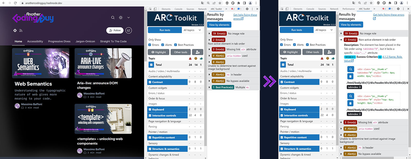
Once installed and activated, you can find its tab between the developer tools. Pressing the “Run tests” button, and after a really short time, Arc gives you a full report in a compact table, easily navigable. You can quickly toggle specific topics to “divide and conquer” your document one section at a time. For each issue, you'll find a brief description and a button to directly jump to the specific code.
User reviews on this tool dropped significantly after a major update, but it seems that Arc is trying to take back what was lost with a series of re-implementation of old (but useful) features.
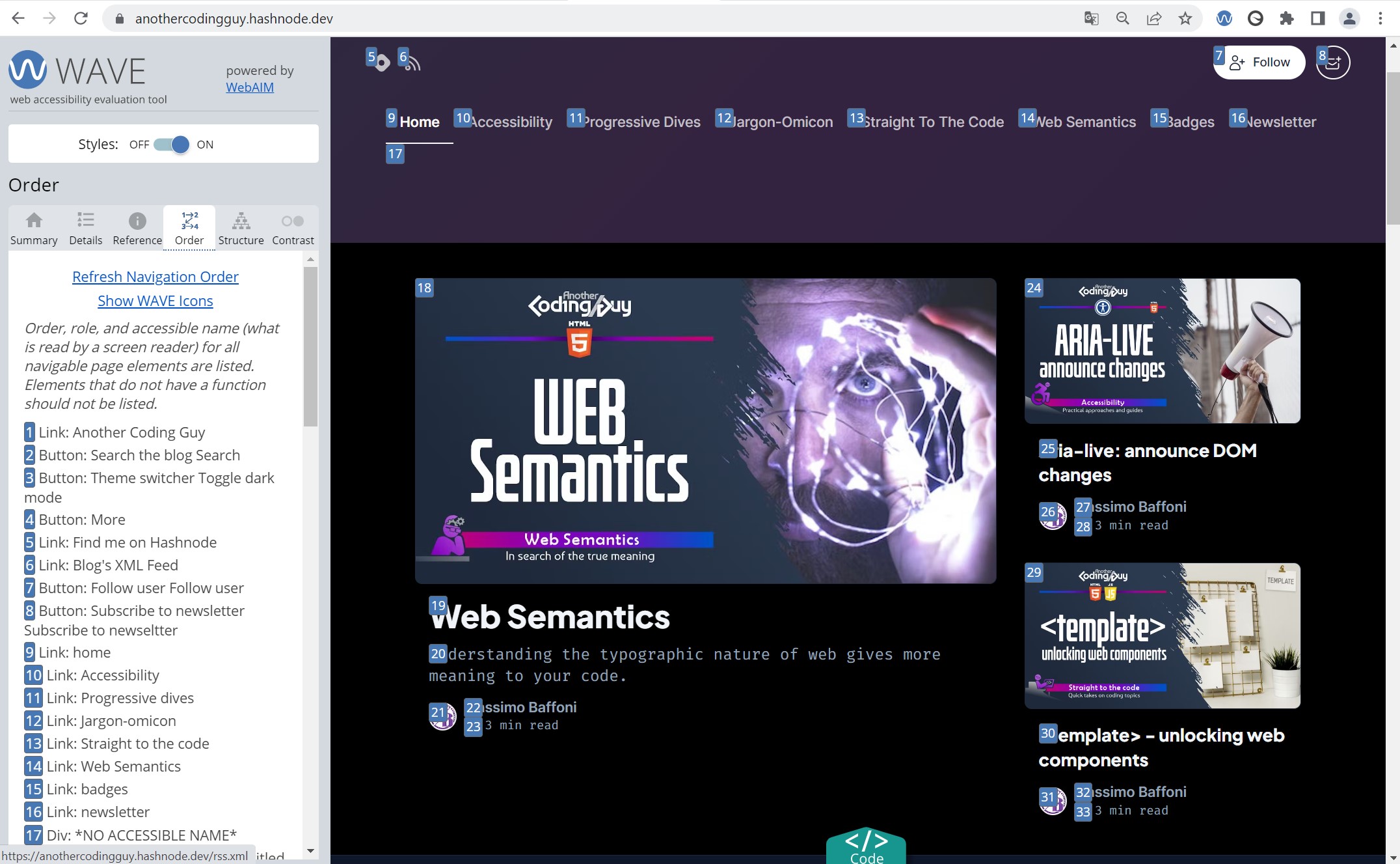
Wave
Chrome extension

At first glance, this tool could seem a bit more challenging than the others, but don't be scared, trust me! This tool, unlike the others, tends to transform your page aspect, adding a bunch of icons and symbols over it and thus changing (sometimes quite a lot) the layout. When you'll get used to that you'll find really useful features. In the main area, you can click on every icon to make a popup appear, containing a brief explanation, while in the sidebar you can find different tabs aimed at analyzing different accessibility aspects. A nice feature is also the “order” tab, which visualizes small index numbers directly over the page representing the tab order of the various elements, to help you understand the expected flow of keyboard navigation.
tenon.io
Online, free and paid versions
You can insert a specific URL or directly a code block to test. Quite useful for snippets, in my opinion, gives its best with its reports, detailing every issue with an easily comprehensible explanation. Unfortunately in its free version the report allows you to see only a few issues at a time and works only with already online URLs.
But if you need, gives you the possibility to tap into its API (paid service) to integrate its services right into your production pipeline.
Chrome Lighthouse
Chrome extension

It's already built in Chrome! And it's free! And it's quite good! You can find it between the developer tools.
Clicking the “Analyze Page Load” button (make sure you choose between mobile or desktop), will start the analysis procedure (it may require some time) and then print a full report about accessibility (but also SEO, best practices and performances) suggesting also what kind of manual test you should perform.
A nice feature is that you can save the audit in a file to forward to other members of the team or to help you compile a report, if you're part of a quality control team.
Siteimprove
Chrome extension
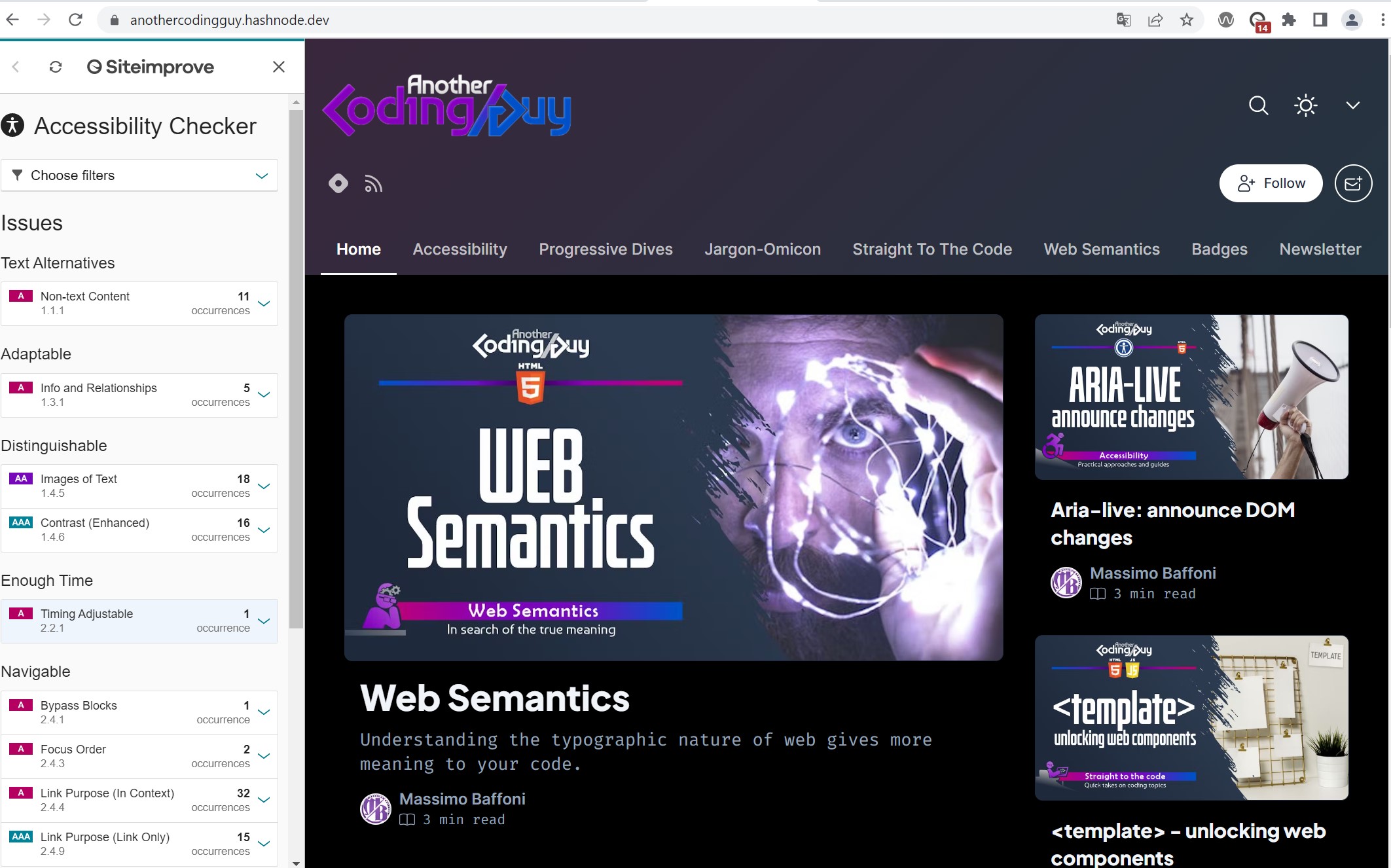
Once installed, go to the website you want to check, click the icon in the toolbar and verify accessibility issues directly on the page.
That's it! For each issue, Siteimprove gives you the chance to progressively go deeper in understanding the problem and the solution, with explanations and details. I think that thoughtful use of this tool could help you to get a better grasp of accessibility in general.
You can click on each issue and, if it refers to a specific visual element, SiteImprove outlines that element for your convenience.
A nice plus is the “Choose filters” button: you can easily address only level A, AA or AAA issues and see who has the responsibility for each problem: yes, you can directly blame someone for a problem (but only if none of the issues belongs to your responsibility!)... just kiddin' obviously, but really useful for understanding how to improve each one's role and work.
Final words on automatic tools
Every tool has its own pros and cons and sometimes results don't completely overlap. So it's better to use them all. You're starting out and you're feeling overwhelmed by the choice? Just grab one and try experimenting. Undoubtfully these tools will give you a huge help in troubleshooting a lot of problems, but keep in mind that these are only a part of what you have to consider, test and fix. These tools help you mostly with “mechanical” issues: they check if elements have their own label, if images have “alt” text... What you'll have to mainly deal with requires human intervention and human interpretation.
Bonus Tip about colors: I know that colors are a matter of UI, but here's a tip that I hope will save you some time. If an automatic tool tells you that a certain contrast is not right or undefined, try to see if you have specified the background as "transparent": some tools seem to not be able to understand what color is below your transparent background and, being in doubt, they label it as an error/possible error.
Bonus Tip about errors and warnings: with experience, you'll notice sometimes "false positives" that make perfect sense if decontextualized from your project. In these limit cases, make sure to write down a couple of lines to explain what's up in detail to accessibility testers: that will help you to join forces and choose the best approach. They're NOT against you, they're here to work WITH you and the team to ensure compliance.
Screen Readers
Screen readers are fantastic tools. Annoying but fantastic. A bit buggy but fantastic. They don't have the same behaviours but... Let's rephrase that.
Screen readers have the potential to be fantastic tools, also for sighted users!
Jokes aside, SR for many people are the main interface to computers and the web. Because of this, despite they have so many aspects to be improved, they are essential in these people's daily life. You'll need to get accommodated in using them, 'cause if you are not used to them, the first experience could be nerve-wracking. Seriously, keep on and resist, you'll get used soon to them.
You can face a couple of different situations:
your clients don't specify wich one should be used as the software of choice. You'll then have to make sure to test your document against the main competitors (we'll see them in a moment), trying to obtain the most uniform reading behaviour between them, starting from the most used ones and progressively adding small touches using the various labelling techniques to "fill in the gaps";
your client has a specific software of choice. Let's pretend you're developing an app for your client's internal use and all its offices use a specific SR: whatever the reason could be, make sure to explicitly ask for all the settings they use (or need). I strongly suggest you to require them in extreme detail (even with screenshots of every option tab) because different settings could lend to really different behaviours.
Let's have a look at the main competitors:
NVDA
PC - Free / Open source
Great tool. I honestly use this one often and more important it's free and open source. NVDA is one of the two main competitors and it seems quite solid. It may lack some advanced features but its diffusion should be a sign of its overall capabilities.
Link to NVDA keyboard Shortcuts
JAWS
PC - Paid license
A pillar in the screen readers field. With its pioneering history and its huge configuration array, it's always one of the first choices when choosing a screen reader. If your client uses JAWS remember to set your configuration options with the exact same values as your client, because the outcome can vary greatly.
Jaws has a couple of important drawbacks: it has a really expensive license and is very demanding in terms of memory and resources. For a developer it's however possible to use it for free because it gives you 45' of free use at the beginning of your work session: if you're testing your document this could end in multiple restarts (in my opinion quite annoying!). You can make a quick check even after the 45 minutes, but keep in mind you'll have just 5 or 6 seconds before auto close.
Link to JAWS keyboard shortcuts
VoiceOver
Mac - free
VoiceOver is the main choice for iOS users, being included in all Apple products. It offers a good amount of options and shortcuts and overall seems quite reliable. Just press Command + F5 and you're ready to go.
Link to VoiceOver keyboard shortcuts
Microsoft Narrator
PC - free
Narrator has the great advantage of being already in your Windows system and ready at your WIN + ALT + ENTER pressure. That's all, unfortunately: its behaviour seems not to be very reliable when reading and interacting. Useful maybe for a really quick scan but, honestly, not so much for tests aimed at final production.
Link to MS Narrator keyboard shortcuts
A final note on screen readers
Note that diffusion share changes greatly year after year, so it's pointless to stick to only one of them. The same is for browsers. If you need or you're interested, you can take a look at the WebAIM Survey (this is the latest when writing this article). Unfortunately at the time of writing this article, there's no direct way to test with iOS screen readers in Windows and vice-versa, sorry: for a comprehensive test you'll have to have both or work your way with emulators.
Screen Magnifiers
WCAG requires that your content should be presented without loss of information or functionality, and without requiring scrolling in two dimensions when the zoom level is set up to 400%. What does it mean? Basically, a user using a screen magnifier at 400% should be able to view your document full screen and that, considering a 1280x1024px base resolution, leaves you with a 320x256px viewport.
This requirement is often underestimated, but consider that we're talking about a way larger percentage of screen magnification users than screen reader ones.
Since the requirement is UI based, a blocking issue could potentially force you to a huge effort to be compliant, so make sure that a content reflow for a 320px resolution has been already took in consideration from the UI designers.
Even if the UI designer should provide the developer with a proper document reflow for a width that small, it's the latter that will have to code the responsiveness and the media queries, so they must be aligned in this to reformat content for different viewport widths.
This emphasises how responsive design is important not only for adapting to different devices but also for allowing vision-impaired users to scroll vertically without a horizontal scroll. Have you got an idea how difficult could be to read long sentences requiring you to scroll left and right?
Screen magnifiers take your simple zoom to another level with additional features and utilities. Operative systems already provide their own magnification software, and from WebAIM surveys of Users with Low Vision it seems that those are the main used ones; anyways you can find also paid license ones with advanced features. Here's a quick list:
Magnifier: PC - free. Launch with WIN + Plus.
Zoom: Mac - free. Launch with Option + Command + F.
ZoomText: PC - Paid version. 60 days free trial.
Supernova: Pc - Paid version. 30 days free trial.
Since it could be disorienting at first, try to start on a low zoom first.
Motor impairment
Motor impairment is a really broad term for a vast array of impairments: a user could find it difficult to move swiftly a mouse, or it could be hard to be precise due to hand tremors. Users could also interact with the document with alternative devices because they cannot operate a mouse. There is a wide array of devices, and I warmly invite you to google them to find out how many and how different they could be.
For these users, your aim is to make sure to offer plenty of space for interaction. Forget 5x5px buttons. The minimum interactive area size is, as per WCAG recommendations, at least 44x44px. There are some exceptions allowed, but try to focus on that size. You can work with padding, specific width and height, font-size... This point should also be taken into account for all kinds of users: trying to click a small button and instead clicking the next one just because they are all tiny and grouped next to each other is an annoying user experience.
Another feature motor-impaired users will thank you for is the "delay". If you're struggling with holding the pointer stable, for example, having a dropdown menu appear and disappear instantly could cause you trouble in selecting an item. Or an immediate change in color when hovering an element could become a "fast blinking effect" if you are struggling across the element border area. You can leverage JS setTimeout and eventListeners.
This little touch will be useful also for non-motion-impaired users.
Motion sickness
Many users suffer from motion sickness, that causes them a varied spectrum of possible diseases, from simple dizziness to migraines, from simple being a distraction from the document consumption and interaction to cause of complete disorientation.
These users have the option to select certain setting to declare their will of a reduced motion version of what they're viewing.
Joining forces with the UI/UX design team, define your style without animations or fancy transitions, coding these styles inside the "prefers-reduced-motion" media query in your CSS files.
@media (prefers-reduced-motion) {
  /* your styles without animation and transitions */
}
Diving deeper into this topic, you'll understand that you'll not need to ged rid of all animations. I'll try to write down some tips about this in a future article.
Conclusion
What I've written here is not meant to be a definitive guide. It's only my take and my experience. It may seem long but... well, no, it's really long indeed. Here I scratch the surface of what a developer should know about producing accessible code, but should be enough for a large portion of your projects. The best approach is to go for it: you'll not be able to make 100% accessible products, but try to be open minded and warm harted. Accessibility lies between coding logically and empathic understanding. It's not an easy path, but rewarding.
Remember, writing accessible code is a competitive advantage for your business, a requirement for many jurisdictions and a skill for a professional. But more important, it's one thing that lets us programmers and coders shape a better future society.